Context-Based Design Systems in Practice - SmashingConf
- Rocco
- September 8, 2026
- 08 min
- Conference , AI
I am attending SmashingConf Freiburg as an employee of Pax—thank you to Pax for the opportunity. I took notes on the talks and am sharing the thoughts they prompted here. This is a personal conference note, not a transcript and not a statement by Pax.
This is the first post in a series of notes from SmashingConf Freiburg. The 2026 conference is taking place in Freiburg from September 7 to 10. The official schedule is here.
TJ Pitre’s talk, Context-Based Design Systems in Practice, started from a practical test: can teams actually find and use the right patterns without guessing? That question has mattered for years, and AI does not change it. TJ walked through the Context-Based Design Systems (CBDS) framework, a model for structuring components, tokens and documentation so they remain useful under real production pressure.
The foundation is naming, governance and adoption: how teams recognise the right pattern, how the system evolves, and whether people can use it in their daily work. AI plays a supporting role. Once that structure exists, AI tools can use the same context to produce more consistent, on-brand work. The notes below explore that foundation and the thoughts it prompted about keeping design and code aligned.
Help teams find and use the right patterns
A component library is only useful if a team can work out which component fits a need and how to use it. Names, tokens and documentation need to explain the decisions behind a pattern as well as its appearance. Otherwise, people have to guess, ask around or create another version of something that already exists.
My takeaway from TJ’s CBDS framing is that this is as much an organisational task as a structural one. Naming helps people find a pattern; documentation helps them apply it; governance gives them a way to propose and review changes. Adoption is the practical test of whether those pieces work together. That foundation helps designers and developers today, and gives AI tools better context when teams choose to use them.
Drift is a product-lifecycle problem
Design intent does not move once, cleanly, from Figma to code. It changes when a requirement becomes more specific, an edge case appears, a product needs a new state, or a developer discovers what a platform actually allows. That is normal product work.
The question is not whether drift happens. It is whether it is visible, intentional and fed back into the system. Without that loop, a design library and a component library gradually become two different descriptions of the same product.
Incomplete design information forces people to fill in gaps, which can lead to inconsistent implementations and duplicated patterns. An AI agent faces the same ambiguity: with a fixed 1px border in one place and an unconnected border-width token elsewhere, it has to guess whether they mean the same thing. It may make a plausible choice, but plausible is not the same as correct.
Make the system’s decisions explicit
One demonstration in the talk was FigmaLint, a Figma plugin that analyses components for design-system compliance, accessibility and developer readiness. My notes include an alignment score such as 87%. I understood that score not as an aesthetic rating, but as a signal of how much of the design is expressed in a structured, reusable form that a developer—or an agent—can work from.
The contrast between a one-off 1px value and a named standard border-width variable is a small but telling example. The aim is to make a decision explicit and reusable, so a developer can recognise the intended value and understand where it applies. An AI tool can then use that same information instead of deriving critical values from pixels or nearby examples.
A well-structured design gives teams a shared reference for variables, components, variants, states and rules. It also gives an agent a firmer basis for generating code that follows the system. A 100% score can be a useful target for the checked rules. It is not, by itself, proof that people can find the right pattern, that the system is adopted, or that a product experience is good.
This is also why a Figma frame alone should not become the source of truth. Figma can be an excellent surface for a specification, but a surface is not the whole specification.
Tools can move the context, not replace the contract
With that foundation in place, tools can make the context available to AI assistants. Figma’s official MCP server can give compatible AI clients design context such as variables, components and layout data; Figma also documents Code Connect as a way to steer generated code toward the components in a connected codebase.
TJ also pointed to tools from his company, Southleft, including Figma Console MCP, which connects AI assistants to Figma for extraction, creation and debugging. These tools make it easier to bring design context into an agentic workflow. They do not decide what a component means, when a new variant belongs in the library, or who approves a change. That is still the work of the system around the tool.
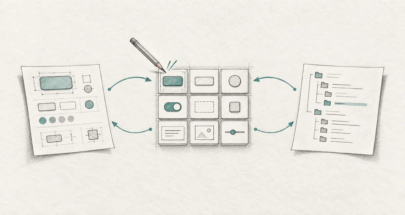
One especially interesting idea raised in the talk is a component contract. This is more than a visual component description: it can capture anatomy, variants, states, tokens, behaviour and accessibility rules in a machine-readable form. The Southleft component-contract proof of concept describes its work as a candidate for a vendor-neutral specification, not as a completed standard. Its central idea is compelling: a contract sits between design and code, changes feed back to that contract, and both surfaces are checked against it.
That is the direction I find most useful. It gives us a place for decisions that should not have to be hand-maintained twice. As software developers, we already know this discipline from API specifications: a shared contract defines what participants can rely on, and code can be generated from it. A component contract applies the same idea to the design-system boundary.
My take: specify first, then generate
For a team to choose and use a component confidently, we need a clear component structure. The same information can also guide an agent. My practical checklist would make explicit at least:
- its purpose and semantic role;
- anatomy: which parts it has and which are optional;
- properties, variants and states, including invalid and loading states;
- tokens and visual rules, rather than arbitrary values;
- interaction, content and accessibility constraints; and
- examples of the contexts in which it should and should not be used.
Figma can be a strong base for this, because it is already where many teams discuss components. But knowledge cannot remain in the designer’s head or only in a comment beside a frame. If it is important enough to guide a developer, it needs to become explicit enough to guide an agent too.
This changes the role of UI/UX designers in a productive way. They take on some of the component-definition work that has often happened only after handoff. In return, developers need to become more design- and UX-aware. That latter shift is already visible in AI-assisted work: when implementation becomes easier to generate, judgment about the right component and the right experience becomes more valuable. We explored that shift in AI Developer Shift: From Code Writer to Quality Guardian.
Storybook belongs in the feedback loop
Taking this further in my own work, I would put Storybook at the centre of the feedback loop between design and development. It provides a rendered, inspectable version of the actual components—not just a design intention and not just source code. That makes it useful across many products and projects: a shared Storybook gives designers and developers the same rendered reference even when components are reused in different applications. Agents can use that reference too.
Building on that shared reference, I would explore the following automated loop. This is my proposed application of the ideas, rather than a walkthrough of TJ’s talk:
- an agent reads the component contract and the relevant Figma context;
- it implements or changes a component;
- Storybook renders the meaningful states and variants;
- a browser check, for example with Playwright, inspects those renders against agreed rules or approved references; and
- the result goes to a person when the difference is ambiguous, product-specific or significant.
Tools such as Story UI point in this direction too: it can use Storybook context to generate component stories, and its documentation recommends Playwright for rendering and checking generated work. The important part is not any one tool. It is that the loop has an executable product surface and a deliberate human decision point.
Pixel comparison is useful, but it is not the final judge. A tiny visual difference can be harmless; a perfectly matching component can still create a confusing flow. Someone still has to inspect components in the product, in their real combinations and mutations—not just in isolation.
Feedback must flow back
For me, this brings the discussion back to governance: what happens when implementation discovers a new need?
Imagine a team needs a red version of a button for one feature. Does that become a component variant? A local exception? A semantic token? Or does the use case reveal that the product’s status model is incomplete?
The wrong answer is to automatically promote every change into a global library. Global component libraries become harder to understand when every one-off requirement turns into a canonical variant. The equally wrong answer is to bury every new decision in product code.
Teams need a promotion rule. A change might earn a place in the shared contract when it has more than one real use case, has a clear semantic meaning, meets accessibility requirements and has an owner who will maintain it. Otherwise, it can remain a documented local composition. The point is not bureaucracy; it is making the decision visible and reversible.
This is particularly relevant for organisations with several products. A shared specification of UI principles, tokens, behaviour and accessibility can guide teams while each product retains its own component library and local compositions. AI could help maintain and check that structure. The shared layer gives teams and agents common context, while product libraries preserve the patterns that fit each product’s needs.
UI precision is not UX completeness
The conversation can go all the way down to a one-pixel border definition. That precision matters. But it must be viewed from the height of the whole product.
UI can often be encoded very precisely: values, states, components and visual rules can be represented in design tokens and code. UX is more than that. It emerges from the interplay of components, copy, information architecture, timing, error handling and the user’s actual goal.
My notes focus heavily on UI detail, which leaves me with a further UX question: how precise can a system be about experience, not only appearance? That is a question I am taking beyond the talk. An agent can validate tokens and variants reliably when the rules exist. It cannot decide, from a component catalogue alone, whether a journey is understandable or whether a new flow solves a real user problem.
Keeping design and code aligned has always been difficult. TJ’s CBDS framing brings me back to the work that makes a system resilient: clear names, connected components and tokens, usable documentation, and ownership of changes. Those things matter whether or not a team uses AI. Once they are in place, AI can help with the tedious parts: extracting context, finding differences, rendering states, checking rules and keeping the evidence close to the change.
The most important loop is therefore not Figma to code. It is a broader loop between designers, developers and the people using the product. Code should inform the specification; users should inform the experience; and both should have a route back into the design system.
If you are building or evolving an app and want to make that feedback loop more durable, we can help with the development and long-term maintenance work. Or get in touch to compare notes.